A supplement brand built from zero.
Protocol Health is Arilo's own brand. Every mark, label, bottle, and frame you see was hand-crafted in-house — from the first sketch to the last shipped asset.
- Brand identity & naming
- Logo & mark system
- Packaging & label design
- Product art direction
- Photography & retouching
- PDP & web design
- Social & campaign
No client brief, no inherited equity — just a thesis about how the body works and a mandate to make it unmistakable. We designed the mark, named the products, wrote the labels, art-directed every bottle, retouched every frame, and shipped the storefront.
One symbol.
Zero compromise.
The Ø reads as a clean slate — a body reset to zero before the protocol begins. It holds at a 16px favicon and at the scale of a full wall of pattern without losing its nerve.

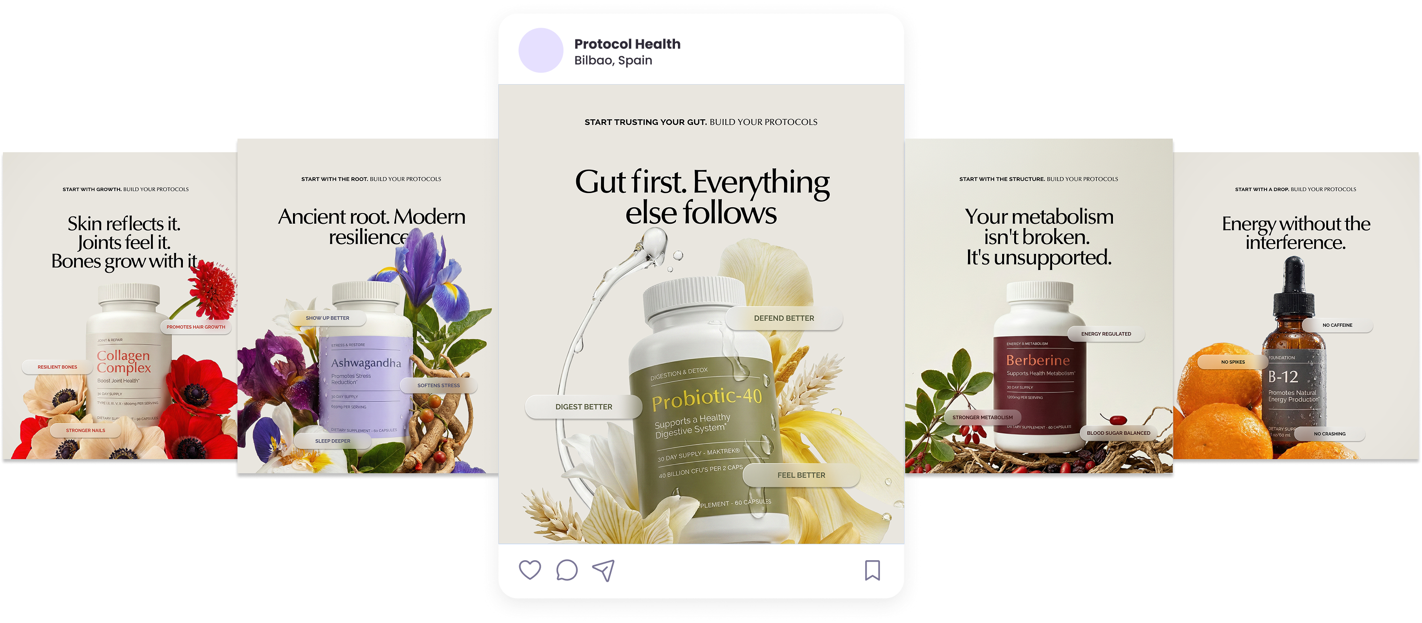
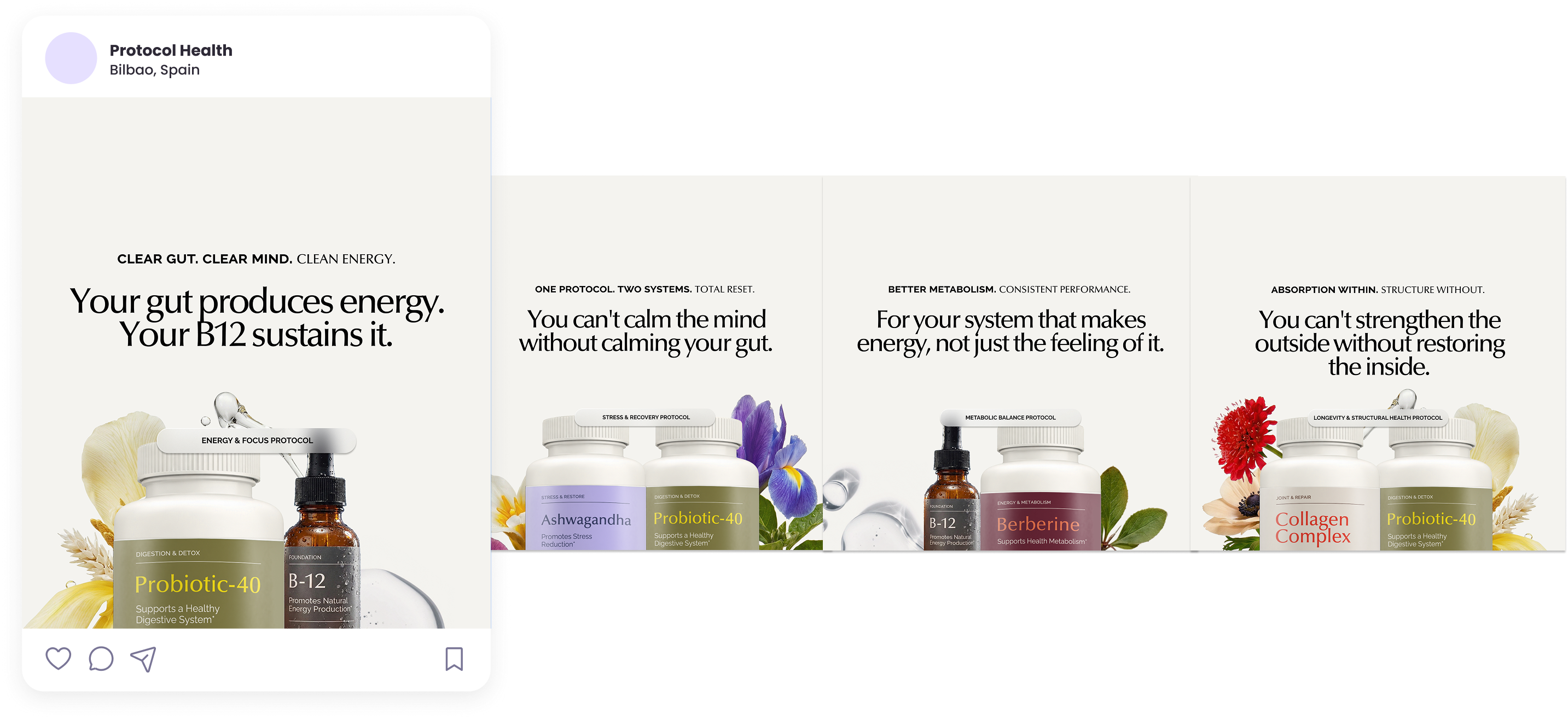
Engineered for the shelf and the scroll.
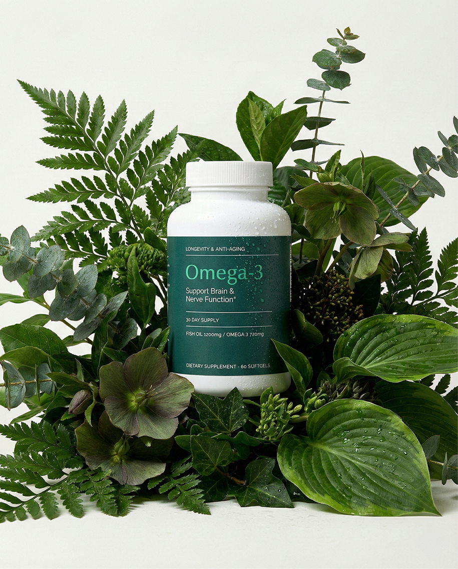
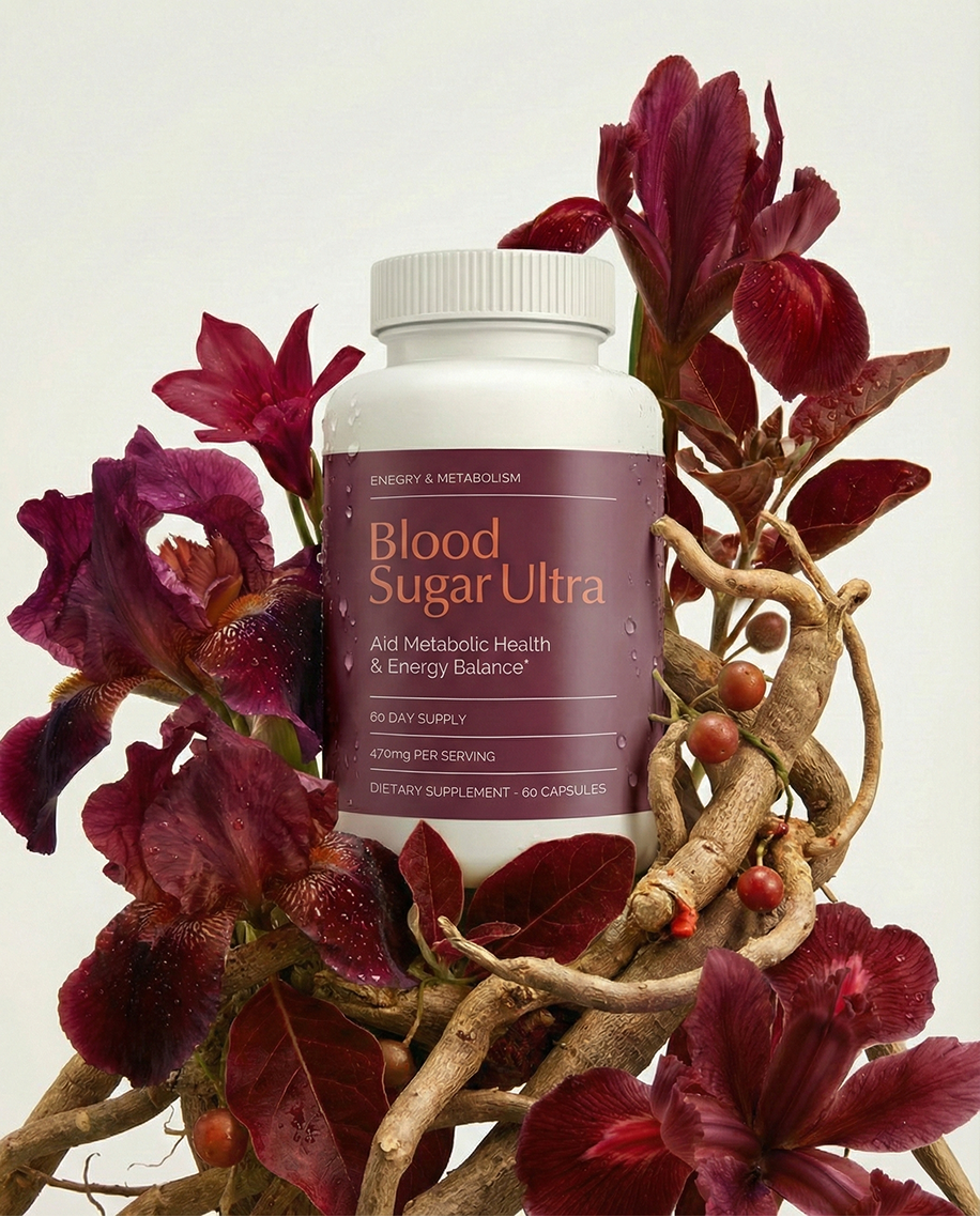
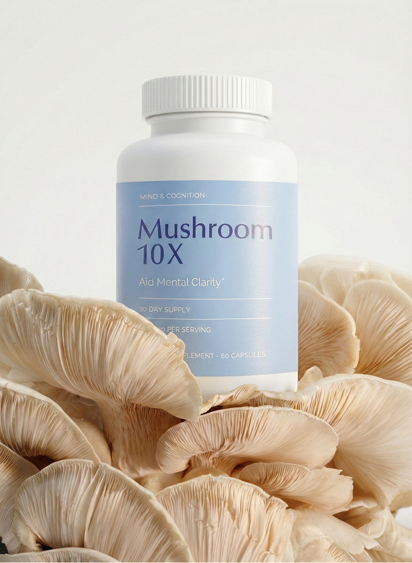
A modular label system carries 20+ SKUs on one grid — ingredient-led names, a calm hierarchy, and accent colours that code each protocol at a glance.
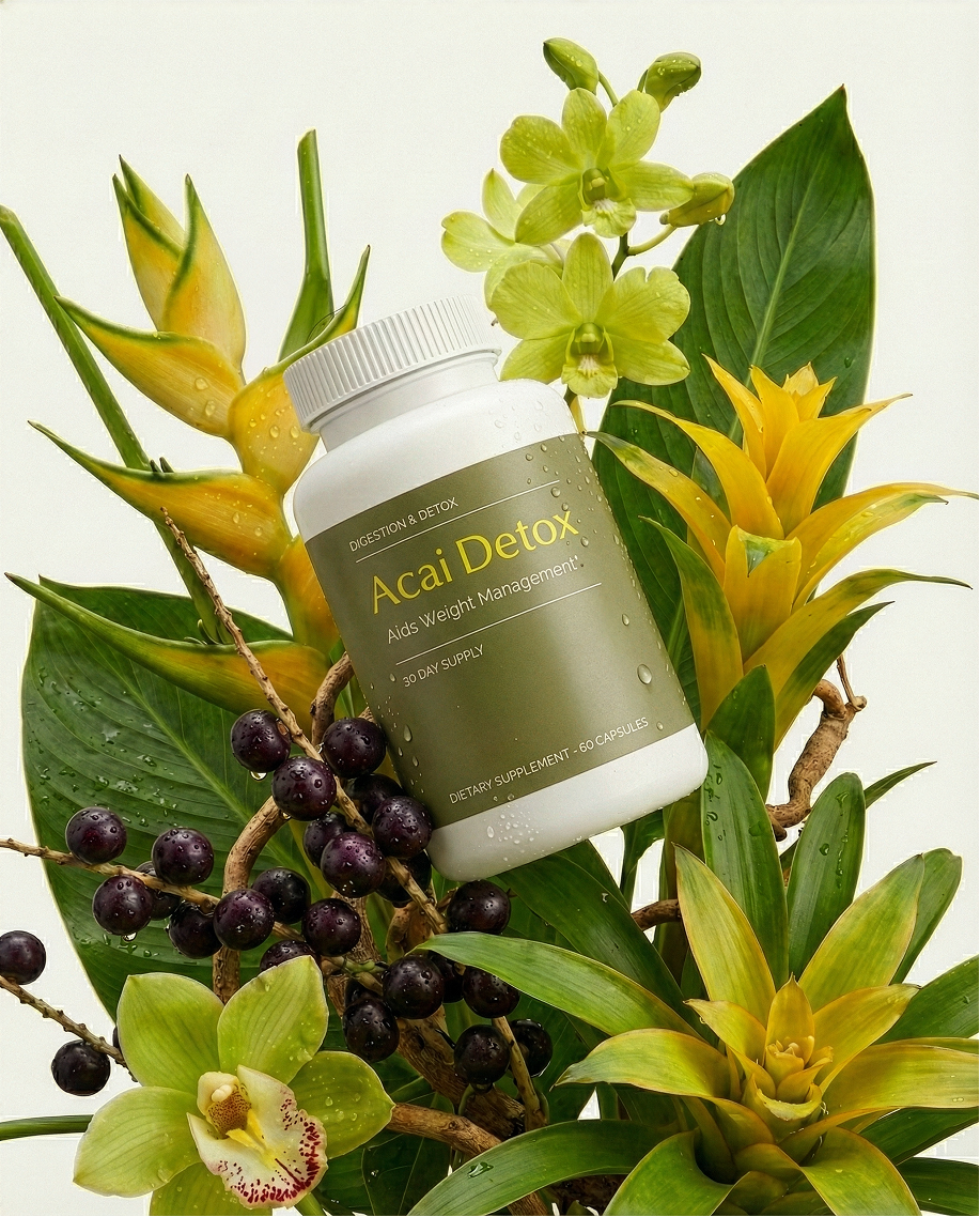
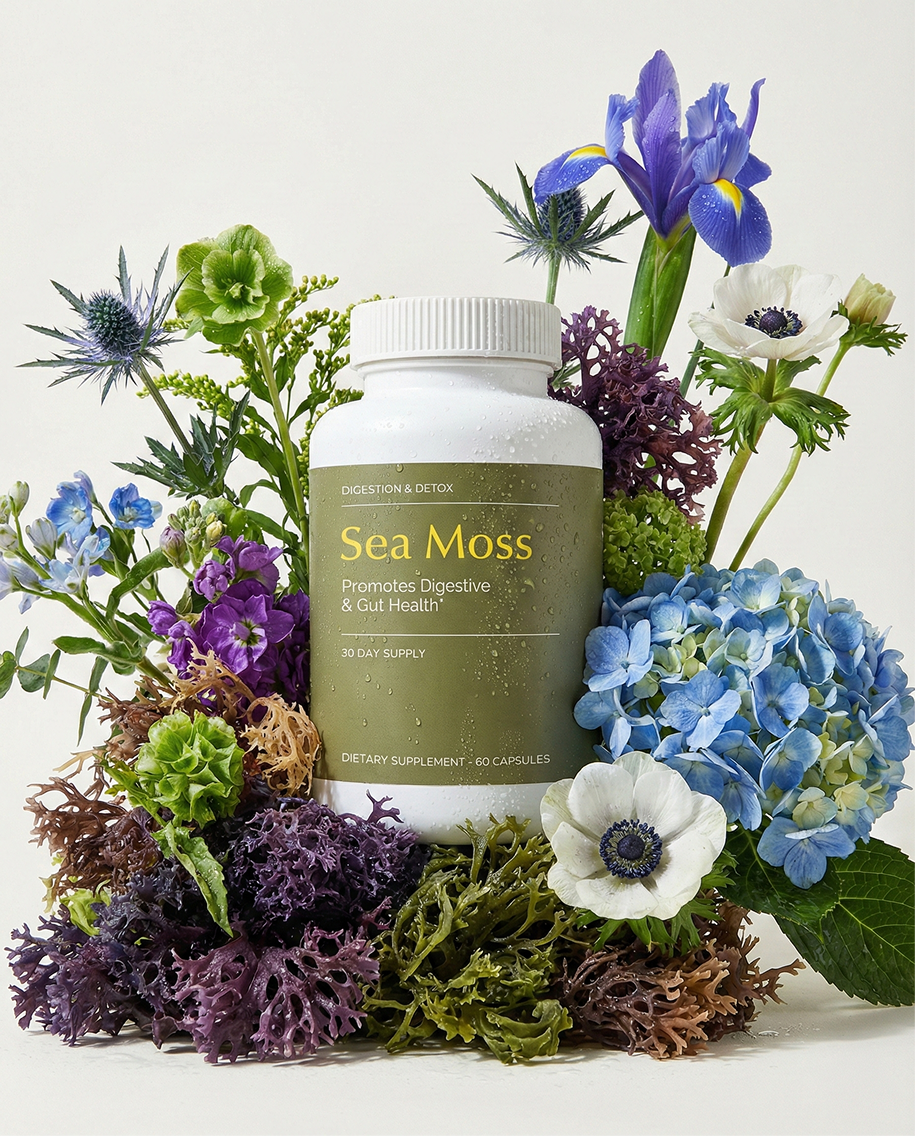
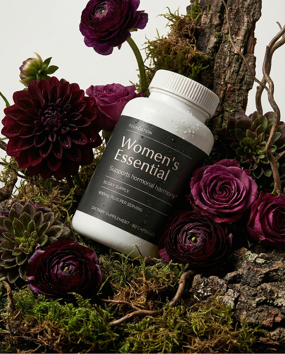
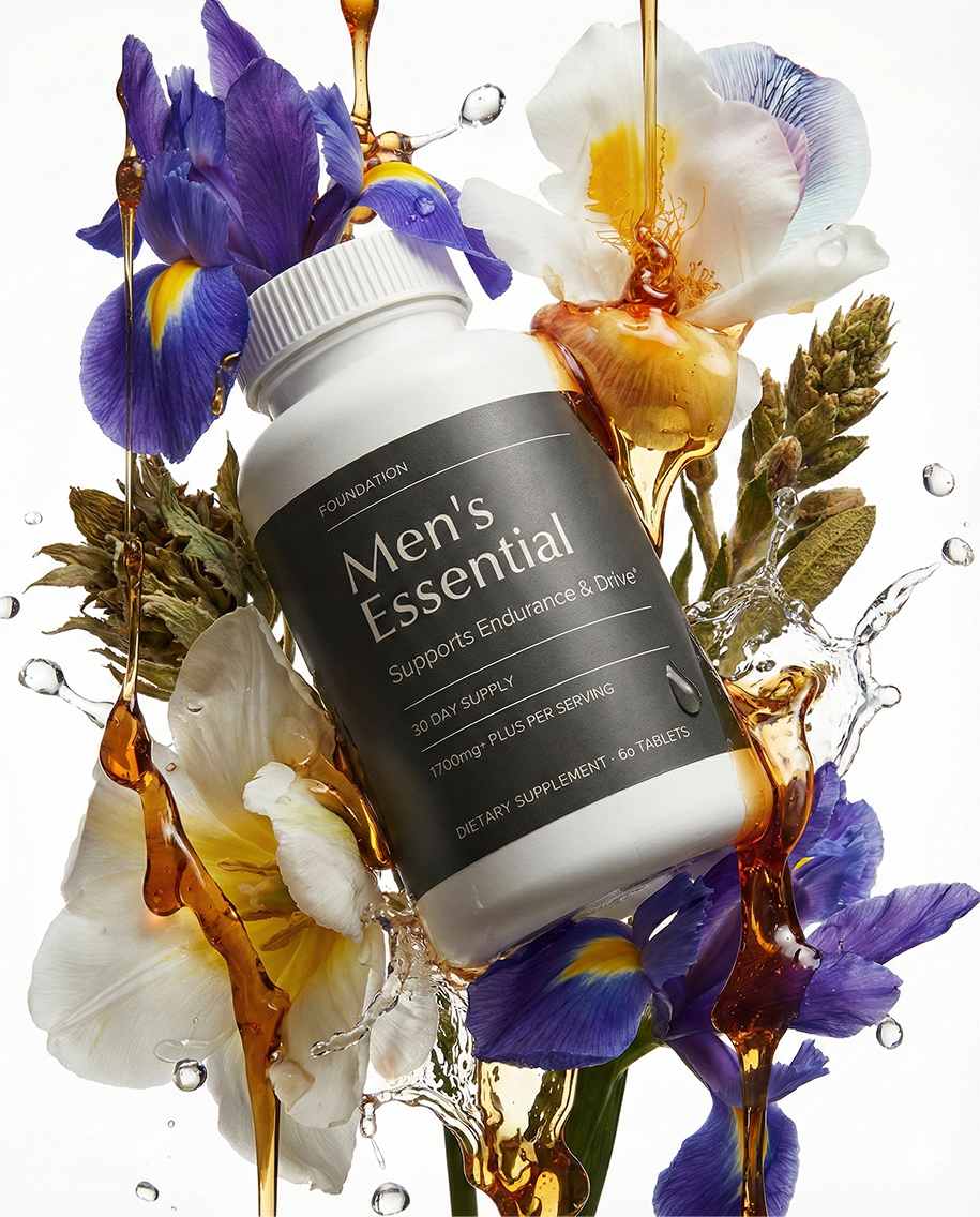
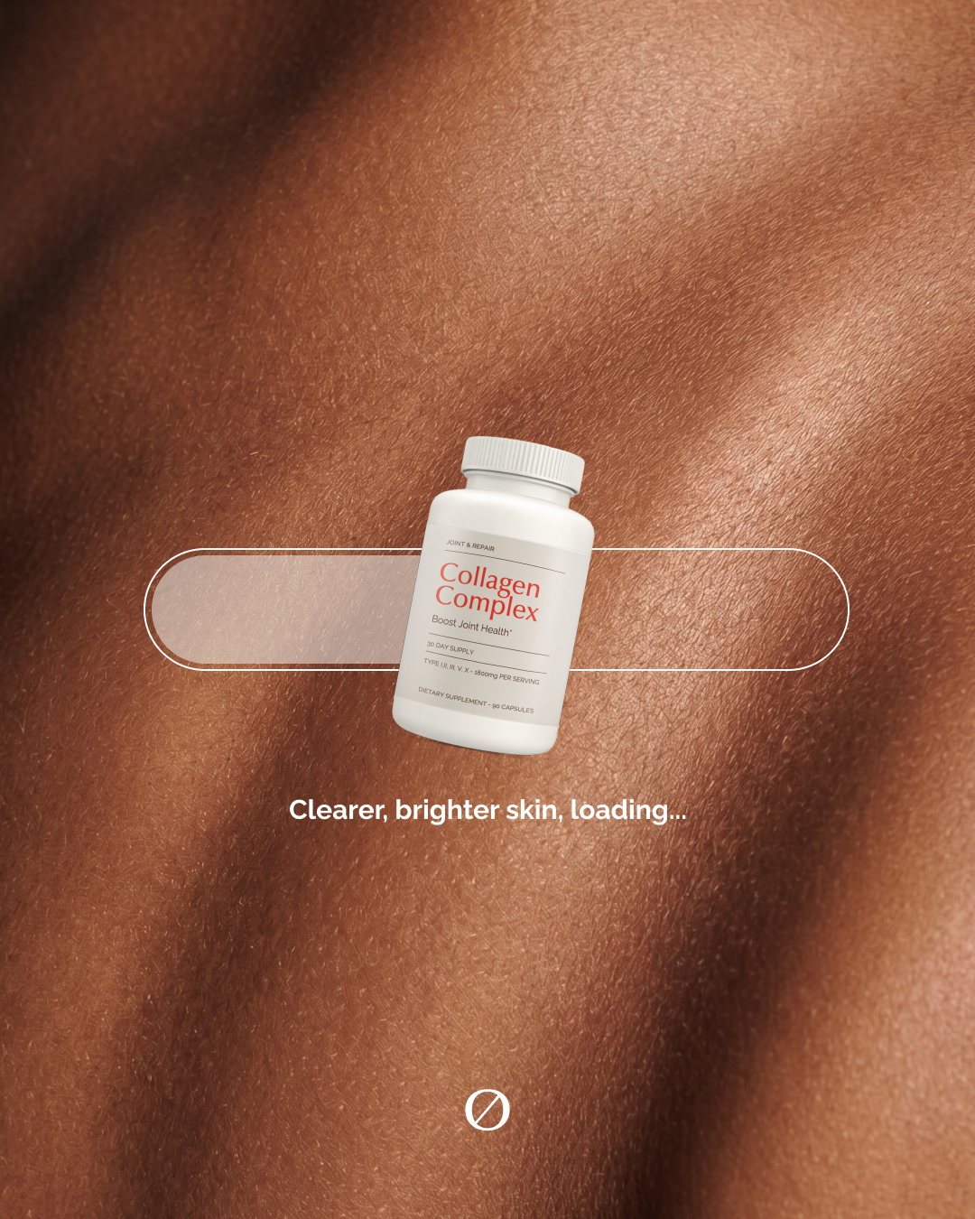
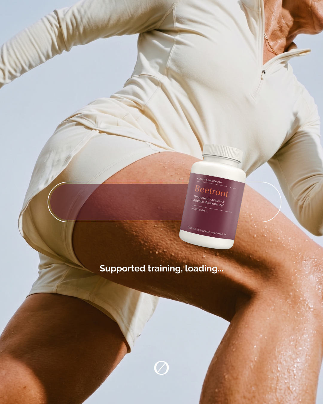
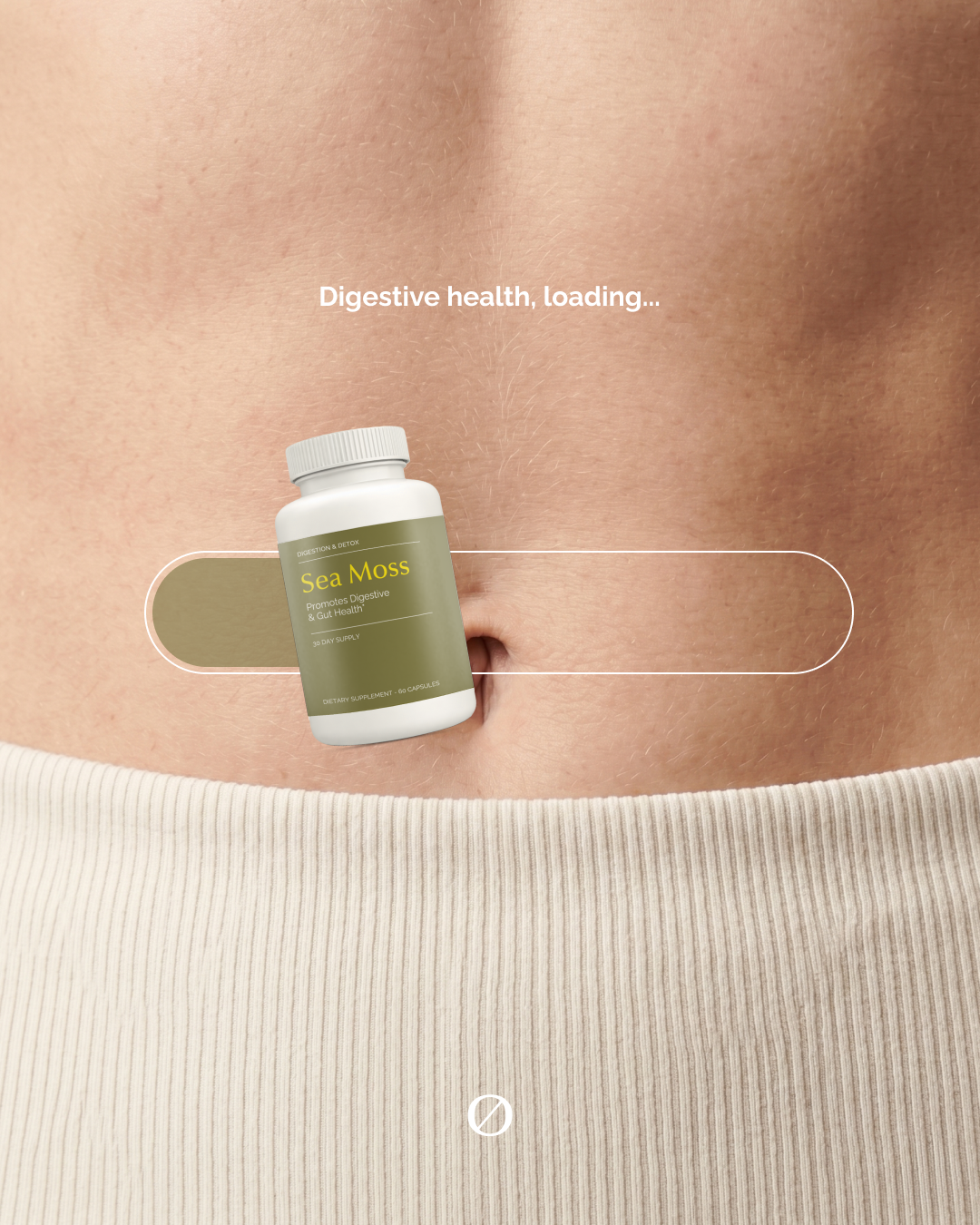
Botanical, clinical, impossible to scroll past.
Every hero is hand-styled and hand-retouched — bottles on skin, in foliage, suspended in light. The kind of craft that earns the premium price before a word is read.
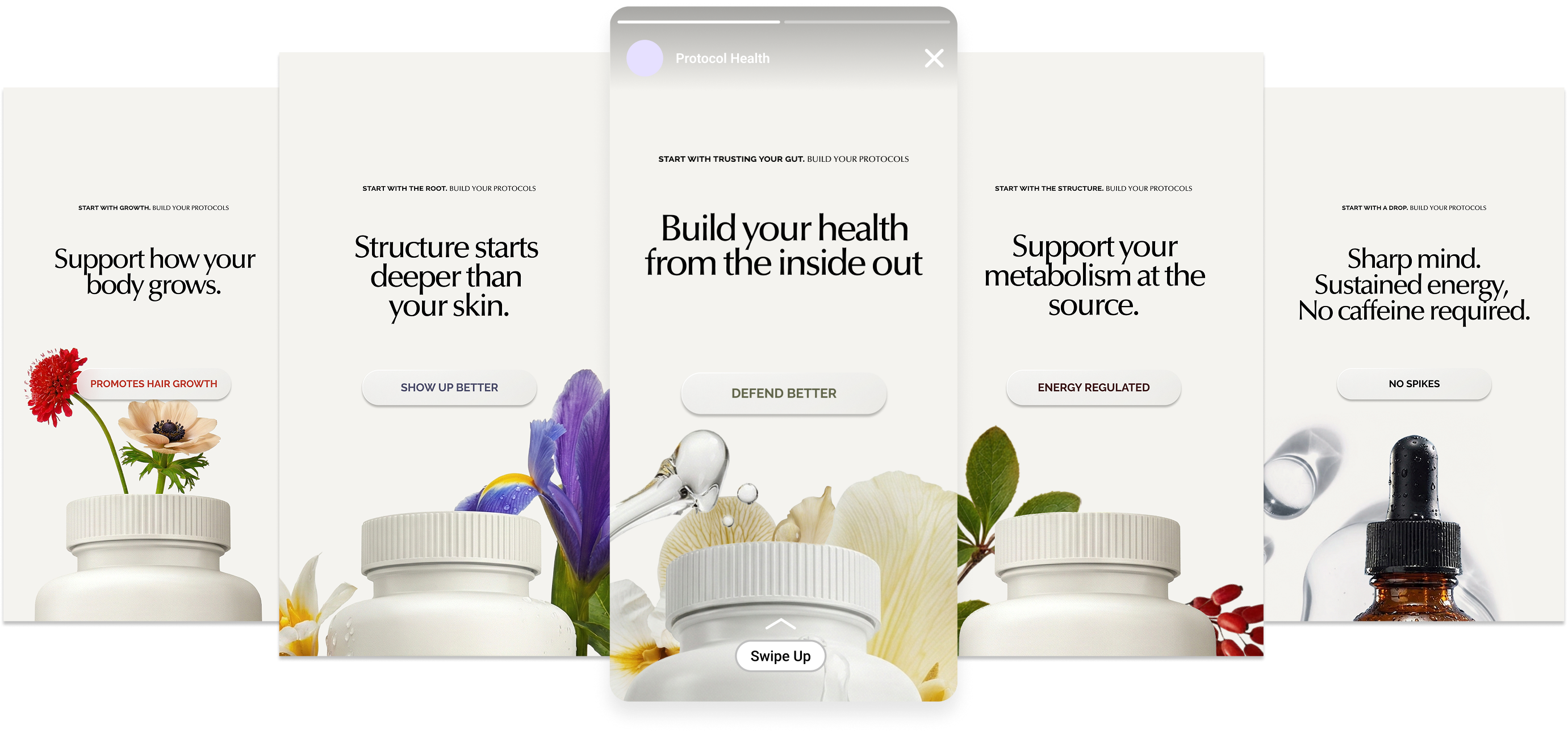
The protocol, told in motion.
Carousels, stories, and launch creative — written, designed, and built to make a supplement feel like a ritual worth keeping.
Proof we run the full stack.
When we say end-to-end, this is what we mean — a brand we own, designed and produced entirely in-house.