A brand refresh, drawn in precision.
A website redesign and full brand refresh for a leading aesthetic surgeon: logo, wordmark, and a proprietary line-field pattern system that draws itself.

- Brand refresh
- Logo & wordmark
- Generative pattern system
- Art direction
- Website design
- Design system
A reputation that had outpaced its website. We refreshed the brand from the mark out: a restrained navy-and-bone palette and a proprietary line-field pattern system that encodes each practice area as its own precise, living contour.
One language, four fields.
Each practice area carries a distinct contour field. Generative line systems that move and grow, precision without a literal image.
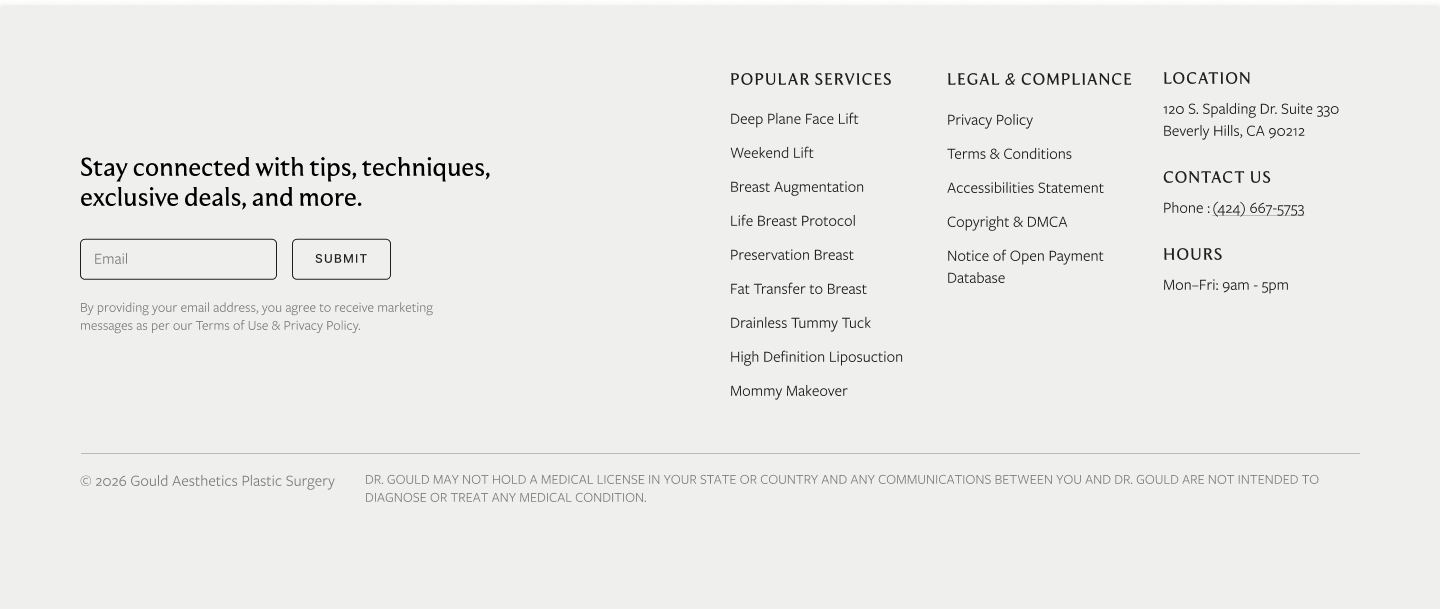
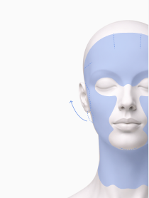
Face
Concentric interference rings calibrate the eye, the visual grammar of facial balance.
Breast
A woven lattice that reads as structure, lift, and considered support.

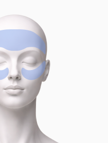
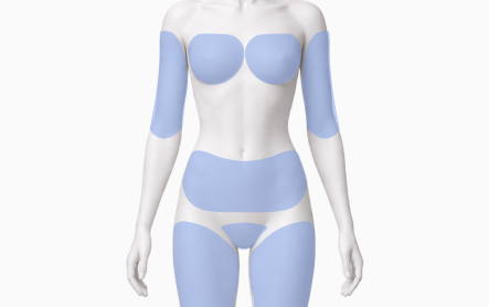
Body
Sweeping axial contours tracing movement and proportion across the body.

Non-surgical
Soft refinement arcs for the lighter-touch, non-surgical register.

Precision you feel before you read a word.
The same lines, on bone.
Navy strokes on warm bone, the brand's second register. One continuous pattern logic across web, print, and signage.


We built it,
block by block.
Every section designed, then stitched into one page. Scroll to watch the Dr Gould site assemble.
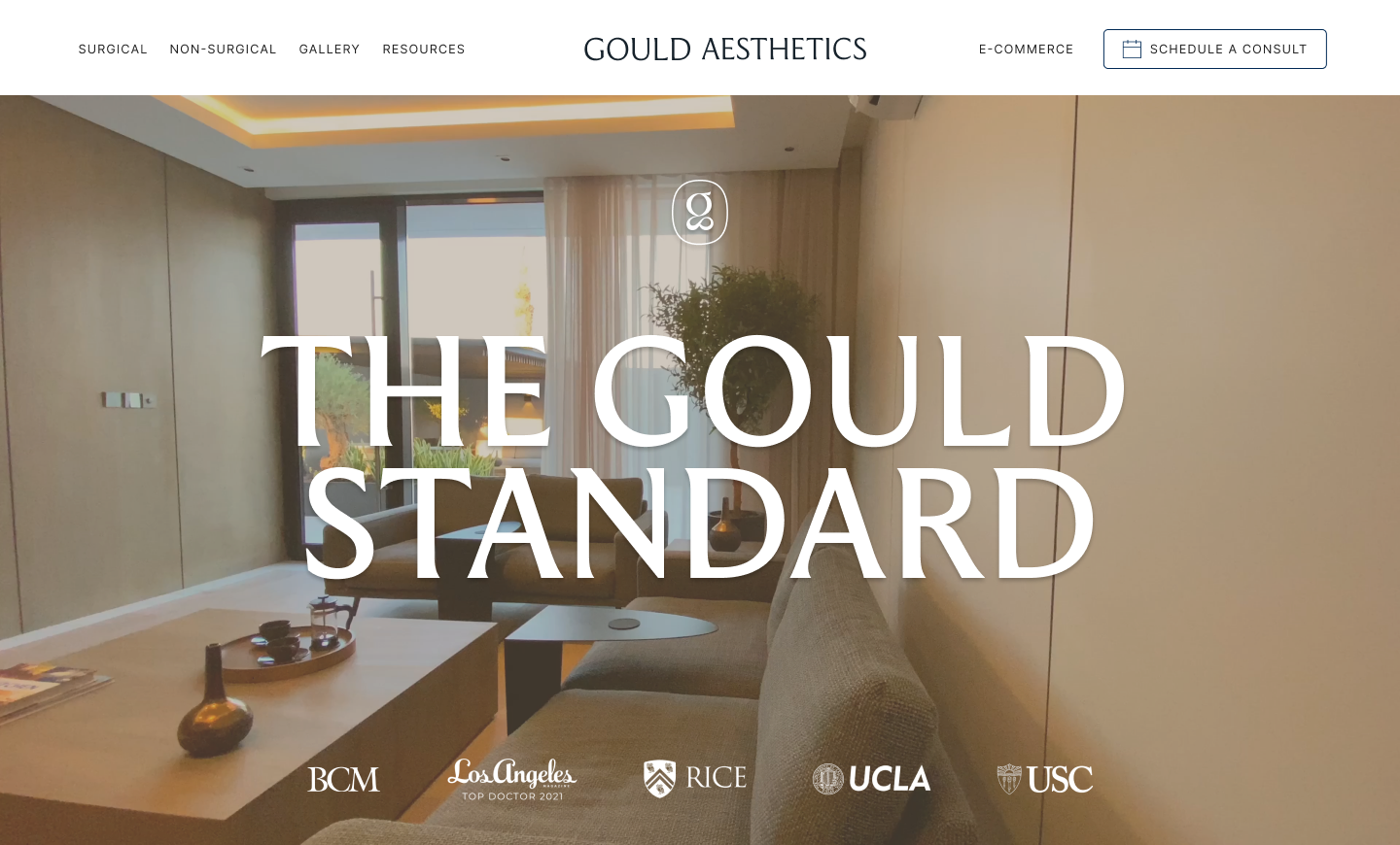
- 01Header & hero
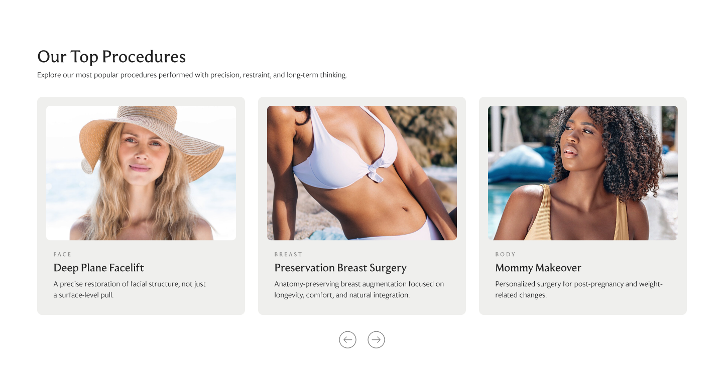
- 02Procedures grid
- 03Featured story
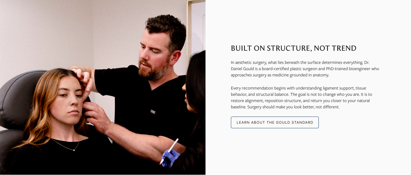
- 04Physician intro
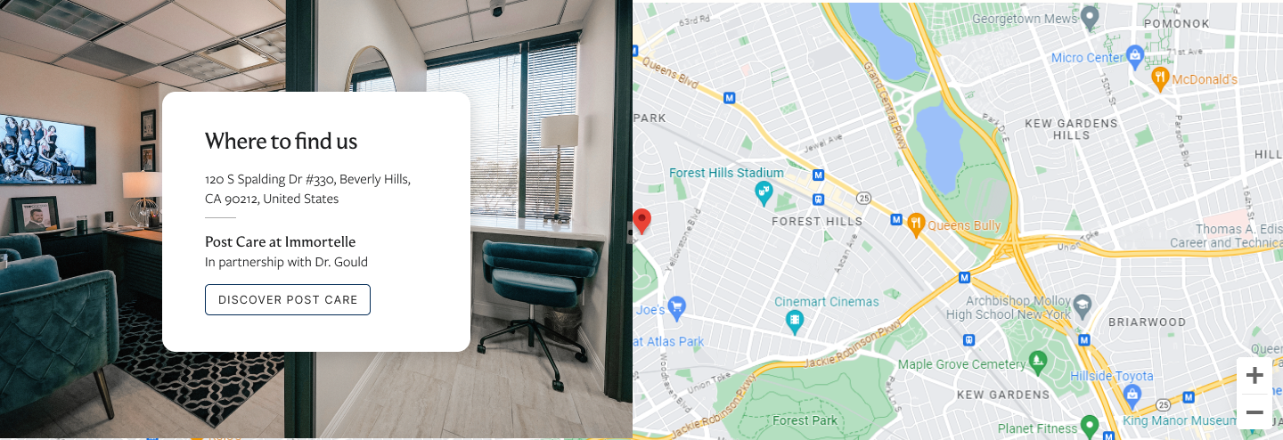
- 05Location & map
- 06Footer & newsletter

Mapped, layer by layer.
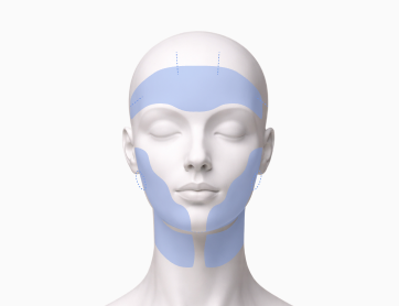
Every treatment visual starts from a clean capture. Scroll, and the precision field draws on, plane by plane, exactly how each asset is built by hand.


A clinic that finally looks the part.
From a generic template to a precise, ownable brand, anchored by a pattern system no competitor can copy.
- A generative pattern system owned end-to-end
- Bespoke
- A distinct contour language per practice area
- Four fields
- From generic clinic site to precision brand
- Refined